The Press Portrait Does More Than Show a Face
A press portrait gives audiences a first impression before a performance begins; learn how pose, setting and styling shape a recognisable public persona.
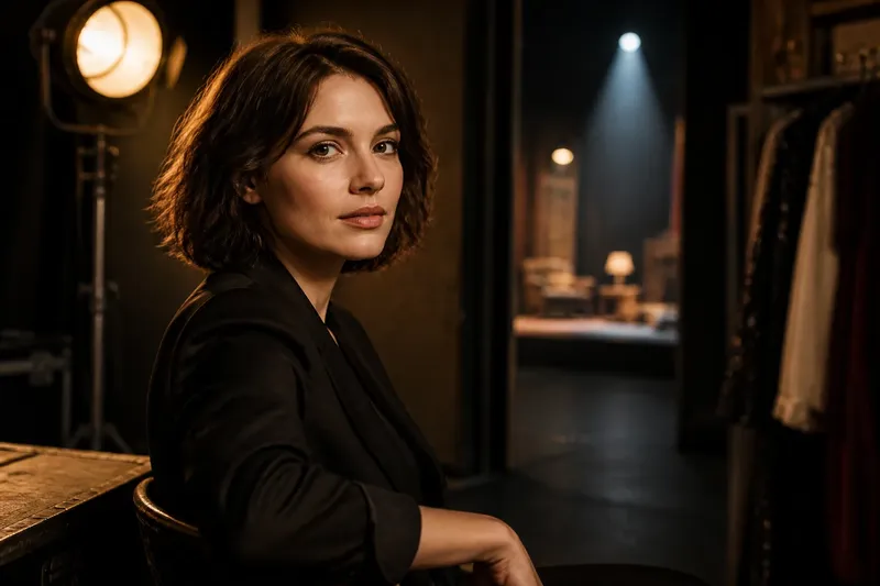
A press portrait can introduce a performer before an audience has heard a line or seen a scene. In publicity, the strongest press portrait is not simply a flattering likeness: it is a recognisable image that sets a mood and makes a compact promise about the public persona to come.
That promise is made through choices a viewer can read quickly: a direct or averted gaze, a studio backdrop or a suggestive location, formal clothing or something closer to everyday wear. None of these choices reveals a private self. They compose a public-facing introduction, and different approaches suit different kinds of performance and career.
Three portrait approaches
Publicity portraits generally lean towards one of three approaches: the signature image, the atmospheric image or the character-led image. They can overlap, but choosing a dominant approach gives the photograph a clearer job and makes it easier to use consistently across press materials.
The signature image
A signature image makes the performer immediately recognisable. It often uses a simple background, clear light and a pose that gives the face room to register. The expression may be warm, composed, wry or unsmiling, but it is kept legible rather than buried beneath elaborate styling.
This approach suits a performer whose public identity needs to travel between different projects without being mistaken for a single role. A theatre actor promoting work across contrasting productions, for instance, may need one image that feels like a stable introduction rather than an extension of the current character.
The trade-off is that a highly controlled portrait can feel generic if its details could belong to almost anyone. A distinctive hand position, a particular angle of gaze or a quietly unusual choice of clothing can give the image an identifying feature without making it fussy.
The atmospheric image
An atmospheric image introduces a feeling before it introduces a biography. Light, colour, texture and space do much of the work: a muted palette may suggest introspection, while a bright, open setting can feel more relaxed and approachable. The face still matters, but the surroundings give the portrait its emotional temperature.
This approach suits a performer whose publicity needs to establish a tone, particularly when a project has a strong visual world or a distinctive genre. It also gives an editor useful material for a feature opener, where the image can create a point of entry before the copy explains the work.
Atmosphere can become a distraction if the setting carries more meaning than the person. A dramatic corridor, coloured gel or prop may look striking, yet leave viewers remembering the composition rather than the performer. Keeping one or two visual elements in the foreground and letting the rest recede helps the mood serve the introduction.
The character-led image
A character-led portrait borrows a controlled detail from a performance: a costume, an object, a gesture or a hint of the project’s setting. It offers an immediate connection between the performer and a particular role, which can make it useful for a release campaign or a production’s press kit.
This suits publicity centred on one project, especially when audiences need to understand its premise at a glance. Its limitation is reach. If the image is so closely tied to a character that it cannot work outside that campaign, it may be less useful as a general portrait or as an introduction to the performer’s wider work.
The distinction is not a strict rule. A performer might be recognisable in a character-led image because the pose or expression has become associated with their public persona. The practical question is which identity the photograph should lead with: the individual performer, the mood of the project or the role itself.
Pose, setting and styling
Pose is more than posture. A straight-on look can create a sense of candour or challenge; an off-camera gaze can suggest thought, attention or distance. A turned shoulder may soften the frame, while squared shoulders can make it feel more formal. These signals are not universal, so they work best when they match the performer’s intended introduction.
Setting also determines how much context a portrait carries. A plain wall lets expression and clothing take the lead, while a rehearsal room, backstage passage or recognisable location can place the performer in a professional environment. A specific setting should earn its place by adding information, not merely by looking cinematic.
Styling connects those choices. Clothing, hair and make-up can establish polish, informality, period flavour or a visual link to a project. The aim is not to disguise the person beneath a concept; it is to make the image coherent enough that a viewer can understand its tone without needing a caption to explain every choice.
Small details matter because publicity images are often encountered at different sizes. A face that reads clearly in a full-page feature may become indistinct in a small listing or on a phone screen. Strong separation between the subject and background, an uncluttered outline and a readable expression help the portrait remain identifiable when it is cropped or reduced.
Recognition across uses
A portrait’s recognisability depends partly on how it travels. The same image may appear in a press release, an interview, a festival programme or a publication’s social post, each with different space around it. A frame designed with room beside the performer can accommodate a crop or a headline; a tightly composed face may be more effective where the image will appear small and alone.
Recognition does not mean repeating one photograph everywhere. It means preserving a coherent impression while allowing different images to serve different editorial purposes. A signature portrait can introduce the performer, an atmospheric image can open a feature and a character-led portrait can support coverage of a specific production.
That distinction also helps avoid a common mismatch: using a project image as if it were a general portrait. If the performer is heavily costumed or surrounded by story-specific props, a reader may reasonably assume the photograph depicts the role. That can be useful when the campaign intends it, but confusing when the purpose is to introduce the person across several kinds of work.
Choosing the right approach
Choose by deciding what a viewer should remember after a brief glance. If the priority is recognition across projects, favour a simple signature image. If the first impression should carry a particular emotional tone, choose an atmospheric image. If the photograph needs to explain a role or release, a character-led image may be the clearest option.
Say a performer is preparing publicity for a new comedy while also seeking interviews about a varied stage career. An invented, practical choice would be to commission a clean signature portrait for general press use, then reserve a lighter, prop-led image for coverage of the comedy. The expected observable result is that the first photograph introduces the performer beyond one role, while the second gives editors a clear visual cue for the project.
Before settling on a direction, consider:
- Purpose: Is this for general press use, a particular production or both?
- Recognition: Can viewers identify the performer when the image is reduced?
- Mood: Does the expression and lighting support the intended first impression?
- Context: Does the setting clarify the introduction or compete with it?
- Flexibility: Will the portrait still make sense beside coverage of different work?
- Crop: Is there enough visual space for the likely placements?
There is no need for every portrait to answer every question equally. A focused image has a clearer purpose than one trying to look intimate, glamorous, comic and mysterious all at once. If a campaign needs more than one introduction, two complementary portraits can communicate distinct things without asking one frame to carry the entire public image.
What should a portrait communicate?
Should a press portrait look natural?
It should feel credible for the introduction it is meant to make, but “natural” does not have to mean unposed. A deliberate pose can still feel open if the expression, styling and setting agree with one another.
Should it match the performer’s latest role?
Only if the image is intended to promote that role or project. A general publicity portrait usually benefits from enough distance from a single character to remain useful across different appearances.
Can one portrait serve every outlet?
One strong image can be versatile, but different outlets may need different crops or formats. A small set of related portraits gives editors options while keeping the performer’s visual introduction coherent.
What makes a portrait memorable?
Memorability often comes from a clear visual decision rather than added decoration: a direct gaze, a particular colour, a distinct pose or a setting that contributes meaning. The detail should point back to the performer, not pull attention away from them.
The promise in the frame
A press portrait is a small piece of storytelling, not a verdict on who a performer is. Its pose, setting and styling suggest how to meet the person in public: with curiosity, warmth, reserve or anticipation. The suggestion works best when it is specific enough to be recognisable and open enough to leave room for the performance itself.
When choosing a press portrait, ask what the frame promises and where that promise will be seen. A clear answer helps distinguish a lasting introduction from a project-specific mood, so the photograph can do its work without pretending to tell the whole story.